
Oval’s Website for Clear Communication & Experience
Case study: A simple, honest website that reflects Oval’s minimal task management philosophy and helps new users understand the product quickly.

Have you ever tried using a task manager and ended up feeling even more overwhelmed than before? Maybe you opened a tool just to add a simple to do, and suddenly you were staring at templates, dashboards, permissions, automations, and features you never asked for. Sometimes you just want a quiet place to write things down and get through your day without feeling like you are managing software instead of your tasks.
That is where Oval comes in. Oval is a small, calming task manager built for people who prefer simplicity over chaos, clarity over complexity, and focus over noise. In this case study, I share how I designed Oval’s first website from scratch, shaping an experience that feels as calm and honest as the product itself.
Exploring the Problem
When I joined this project, the main challenge was that Oval had a fully functioning product but no website to introduce it to the world. If someone visited the domain, they would only see a blank space. No explanation. No brand presence. No UI previews. No trust building. Nothing to help a new user understand whether this product was meant for them.
This lack of presence meant users were forming no impression at all, which is just as harmful as forming a wrong one. A product like Oval, which is intentionally minimal and calm, needs a website that communicates that personality immediately. This made me realise that my job was not to make a loud marketing site but to create a gentle, trustworthy introduction that felt true to the product’s character.
What Does Oval Do
Oval is a lightweight task manager designed for people who prefer simplicity. Instead of offering an overwhelming list of features, Oval focuses on the basics done beautifully. You can capture what you need to do, organise tasks into simple lists, and stay on top of your day without being buried under features you will never use.
People who choose Oval usually fall into a few groups:
Freelancers who want to stay organised without complexity
Students who need a reliable place to track assignments
Early stage founders who need clarity, not clutter
Individuals who feel anxious inside heavy tools like Notion or ClickUp
Oval gives users mental space, not mental load. And the website needed to communicate this exact philosophy through its tone, visuals, and structure.
My Design Process for This Project
My design process begins with understanding. I always start by spending time inside the product so I can see not only how it works but how it feels. Oval felt peaceful, uncluttered, and comfortable. Once I understood this emotional intention, it shaped every decision in the website design.
From there, my process moved through these steps:
Deeply understanding the product’s purpose
Learning about its typical users
Translating the tone into a communication style
Building the story structure for the website
Creating the information architecture
Turning the structure into wireframes
Shaping the visual guidelines
Finally building the real website in Framer
At every stage, I made sure the website remained authentic and aligned with the product’s personality.
Understanding the Product
I spent time creating tasks, reorganising lists, and simply navigating the tool. The calmness of the interface stood out. Nothing tried too hard. Nothing demanded attention. And nothing felt complex. The product’s identity was built on emotional clarity, not feature overload.
This understanding helped me realise that the website should not be overly designed. It should not rely on abstractions or metaphors. It needed to feel direct, clean, and respectful. Visitors should feel calm the moment they land on it.
Sitemap
Once I had a clear sense of the tone and purpose, I mapped out the website’s sitemap. For me, a sitemap isn’t just about structuring pages, it’s about creating a natural story that flows from curiosity to clarity. I think of what questions a user might have at each point and place the right content exactly where those answers should appear.
The sitemap for Oval looked like this:
Navbar – Simple navigation that keeps the experience light and intuitive.
Hero Header Section – A calm, clear introduction to what Oval is and why it exists, paired with a primary call-to-action.
Logo List Section – A quick trust-building moment featuring partner or client logos.
Feature Section – Highlights the main benefit or unique capability of the tool.
Testimonial Section – Builds credibility through real user feedback and results.
Features List Section – Showcases three to four additional benefits or features that matter most.
How It Works Section – A visual walkthrough of the day-to-day workflow inside Oval.
Feature Section (Use Case) – Demonstrates how Oval fits into a specific real-world scenario.
Feature Section (Integration) – Highlights key integrations that enhance usability.
FAQ Section – Answers common user questions clearly and confidently.
CTA Section – Encourages visitors to get started with a simple, transparent next step.
Footer – Provides closure with essential links and contact details.
This flow felt natural and reflected the product’s calm, confident personality, informative but never overwhelming.
Wireframing
Once the narrative was locked, I began creating wireframes. I kept them intentionally rough. The goal was not to perfect alignment or spacing but to test how the page flowed emotionally. Was the scroll comfortable? Did the information feel heavy at any point? Did the UI have enough room to breathe?
This stage confirmed an important insight. Oval’s interface was simple and visually appealing on its own. That meant the website should rely heavily on real screenshots to build trust. No abstract illustrations were needed. The product itself is the best storyteller.
Visual Guideline
With the layout structure ready, I moved into establishing the visual direction of the site. The visual identity of the website needed to mirror the product’s calm and uncluttered nature.
I created a system using:
Soft neutral colours to keep the interface relaxed
Plenty of white space so the design never feels crowded
Rounded components to reflect the product’s UI style
Warm, readable typography that feels human
Light shadows that provide depth without distraction
I avoided anything that could make the design feel aggressive or loud. Every choice was intentional so the visitor could feel the same calmness that the product offers.
Final Showcase
After assembling everything, the final website became an honest representation of Oval itself. It is a simple, transparent, and calming page that guides users without forcing any interaction. The UI takes center stage. The messaging is clear and unpretentious. The pacing is gentle and predictable.
The final experience feels less like a sales page and more like a quiet introduction to a tool that respects your focus and attention.
You can view the live site here:
https://courageous-closet-446051.framer.app
Hero Section
Features section
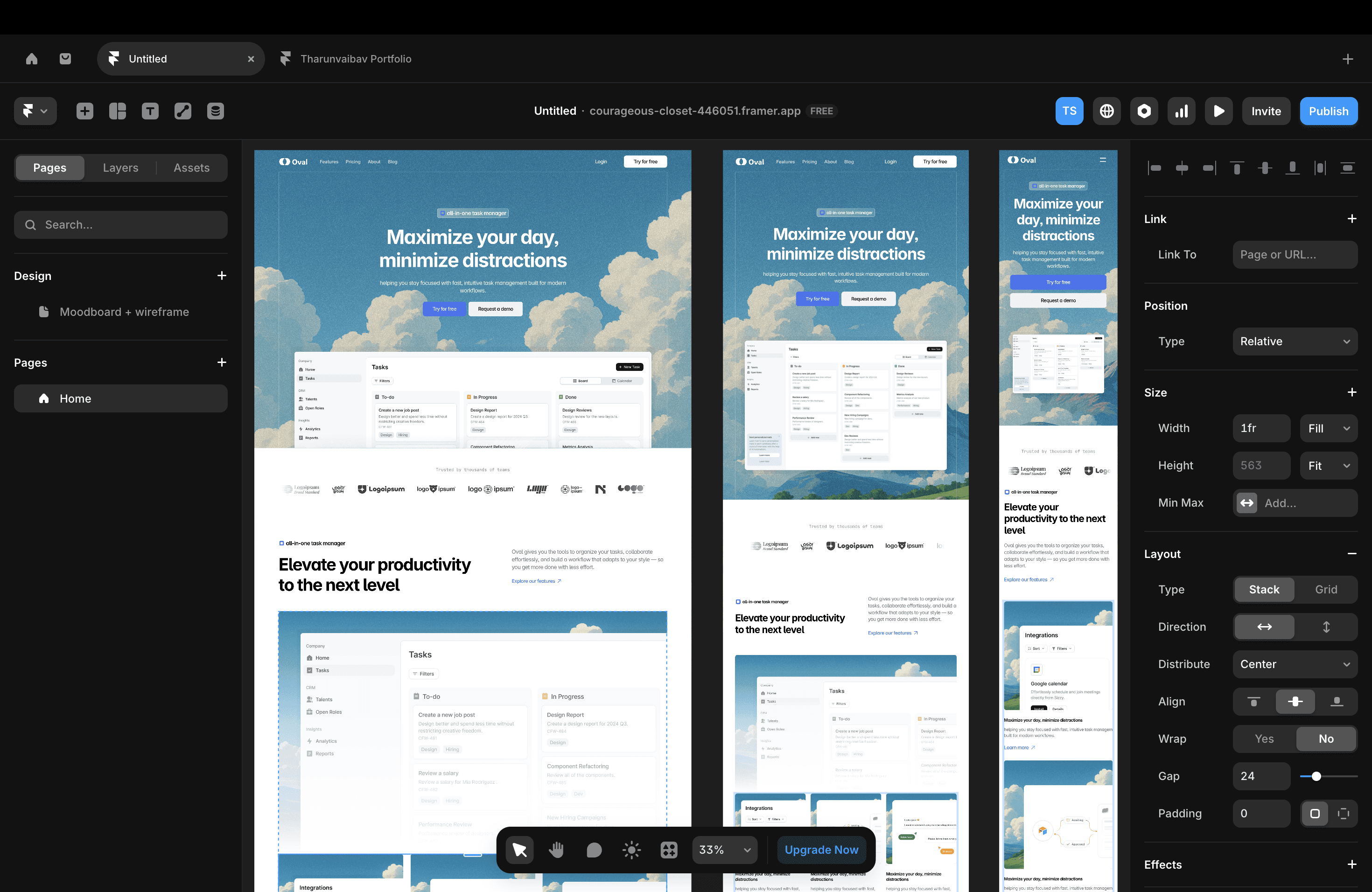
This section introduces Oval’s key features with a clean, modular layout that’s easy to scan. A clear headline sets the context, while the supporting paragraph explains the value in simple terms. Each screenshot highlights a specific capability, helping users quickly understand how Oval fits into their workflow. The goal was to keep things lightweight, visual, and instantly clear.
Testimonial section
How I Developed the Website in Framer
Designing the website was only half of the journey. I also developed it directly inside Framer, which allowed me to bring the design to life exactly as I envisioned it. Building in Framer gave me the flexibility to maintain the calm, minimal tone without compromising on responsiveness or performance.
Here is how I approached development:
Building reusable components
I built components for the hero area, feature blocks, buttons, cards, and sections so that everything remained consistent and easy to update. This helped me maintain visual consistency and reduce repetitive work.
Integrating real product screenshots
I imported high quality screenshots from the Oval app and placed them carefully to feel like natural extensions of the page. Framer’s image handling made this process smooth and accurate.
Creating smooth, gentle interactions
I avoided flashy animations. Instead, I used soft fade ins, subtle transitions, and natural movement so that nothing felt harsh or sudden. These details reinforced the calm nature of the brand.
Responsive behaviour
Framer’s responsive system allowed me to customise layouts for mobile views without breaking the visual tone. I maintained the same spacious feeling on smaller devices, avoiding compressed or cluttered layouts.
Final optimisations
I refined spacing, alignment, and performance to ensure the site loaded quickly and felt smooth across all devices. The final build feels exactly like the Figma design, which was one of the main goals of this project.
Building in Framer helped me keep full control over the final experience, making sure every detail of Oval’s personality carried through from design to real interaction.


